Folks,
As I go about my daily life, I tend to observe things and then think how they relate to my work. It’s a blessing and a curse. When working for an insurance company, for instance, I could not watch Fast & Furious movies without thinking how huge their insurance premiums must be with all those modifications. Yikes.
Recently, I had to go on an emergency international trip with multiple connections on different airlines. We all have been to the airports. A typical airport layout has a central hub area and long gate corridors stretching out of it. There are numerous signs, sometimes in multiple languages, directing passengers to their gates, providing flight and terminal information. Most advanced airports even have interactive maps where you can find places to eat and buy an overpriced USB cable.
It’s hard to imagine a place that would have better signage and be easier to navigate. And that is usually the case when you have just entered the terminal from outside.
But if you have just arrived at gate C666 with 20 minutes to get on your next flight, it’s usually a very different story. You are not a typical focus group passenger: fresh as a daisy, nonchalantly rolling a carry-on bag with one hand and holding a Starbucks cup in another as a badge of honor. No, you are a sleep-deprived, agitated, confused, high on adrenaline shell of a person. You need to run but in what direction?
I suspect most airport designers haven’t tried to look at their creations through the eyes of transit passengers. Otherwise, there would be more and better signs visible from all directions and all eye levels. There would be monitors with flight information placed more frequently than one per square mile.
What Does This Have to Do with Software?
Just like airports, software applications are frequently designed with only one vision and specific user groups in mind. But we need to assist users when and where they need it, not where we think it should be or where it’s easier to implement.
In classic ABAP, this could be as simple as writing short documentation to go with a report. This documentation then manifests itself as the Information (i) button on the toolbar.
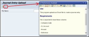
SAP Fiori UI offers even better and more robust possibilities, such as SAP Companion (aka Web Assistant).
Design With Empathy
Another aspect software and UX design needs to consider is the state of the user’s mind and their environment. Air travel can be very confusing: you are suddenly in a new, unfamiliar place, sometimes in a different time zone or even on a different continent. Stress can do a number on our mental ability. A tired transit passenger will not have the same sharp perception as someone who just arrived at the airport.
In Mindset projects, we apply Design Thinking that emphasizes empathy to address exactly these concerns. Are the users in a noisy or poorly lit environment? What else is going on when they’re using the application? What is their level of familiarity with technology?
Keep in mind that empathy is different from sympathy. While sympathy is about acknowledgement, empathy is an ability to understand and share someone’s feelings and needs. Using empathy and involving diverse user groups in design, we can solve not just a specific need but improve overall experience for many users.
Safe travels!
* * *
I’d like to thank Mindset UX Designer Michael Fu for his help with creating this post.
View our LinkedIn, here