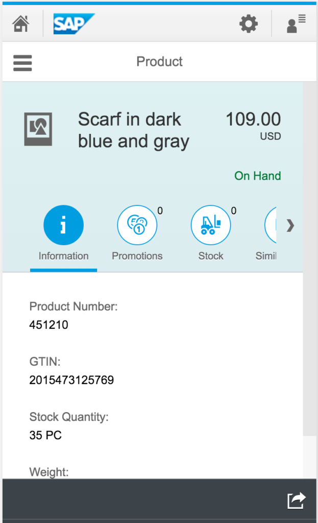
This Tab Strip seems to make its way into most standard SAP Fiori apps, such as the Retail Product Look Up app: Look Up Retail Products
I have 3 issues with the Icon Tab Strip:
- One icon always seems to be taken up by “Information”, which is 1/3 of the available screen real-estate.
- There is only room for 2 more icons, or else the dreaded scrolling bar appears.
- Clicking an icon that is already open, closes the details below it. Why would you ever want that closed?
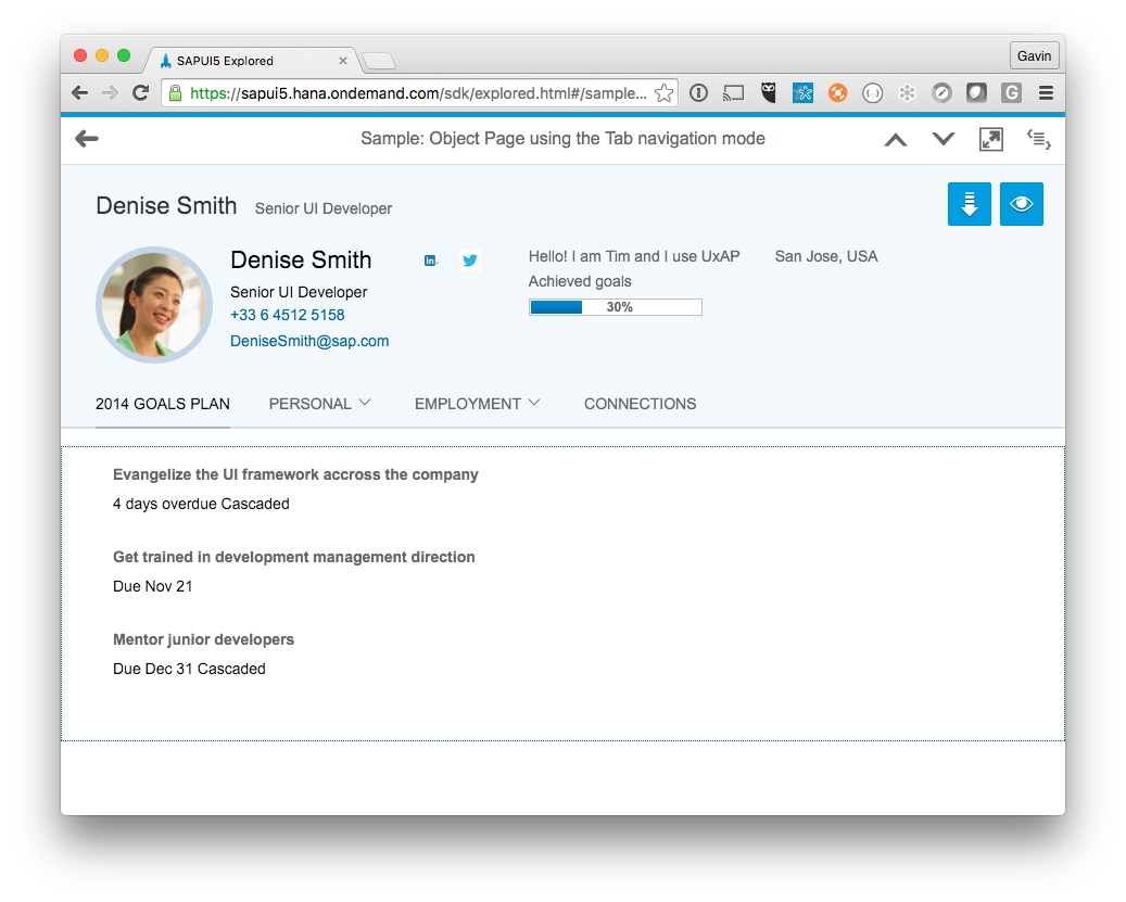
I believe that in a mobile app, vertical scrolling is always preferred to horizontal. Let me instead suggest:
- If you have header information, just put it in the header at the top.
- If you have several sections (and multiple apps doesn’t make sense), then this layout may work better: Object Page.
- (The Object Page also suffers from some tab issues, but hoping to fix those with CSS)
- Just use a segmented button instead of Icon Tab Strip.
This looks better:
Thoughts?
If you are interested in viewing similar articles, visit our blog, here.
View our LinkedIn, here.